
SPOTIFY ADD-ON FEATURE
ABOUT
Spotify is a digital music, podcast, and video service that gives users access to millions of songs and other content from creators all over the world but lacks an important feature.
MY ROLE
UX Researcher, UI Designer
OUTCOME
Provided a new way to explore events within the application without alternating Spotify's platform
RESEARCH & DISCOVERY
THE PROBLEM
An underrated feature within Spotify is the current inefficient user interface for exploring relative artists’ concerts, tours, or festivals. Currently, there is only one way to view concerts and festivals by viewing them strictly within an artist's profile. Secondly, this constricts users to only view events per artist based on whom the user searches for. Ultimately limiting fans from exploring new artists and upcoming events

- The homepage navigation bar only has 3 options, home, search, library

- A user can only see upcoming concerts for
the specific artist they are interested in within that artist's profile. This means fans can't view other artists' events unless visiting their specific profiles.
Therefore no way to explore new events or artists

- Minimal amount of information provided when a user clicks on "Live Events"

- If a user clicks on "see all events", they are only greeted with all events from just the one artist they are viewing. Not other artists which contradicts "viewing all"
COMPETITIVE ANALYSIS
A competitive analysis was conducted in order to get a better understanding of how and which features comparative applications utilize in their product to facilitate better event exploring.

USER INTERVIEWS
11 conducted interviews showed that existing clients were able to play music, search for artists, and create playlists with no problem. Based on user testing, it was easy to distinguish how people struggled when searching for upcoming events from their favorite rapper, DJ, or artist. However, they were plagued by the confusing and disorganized layout for exploring new events. Overall causing little to no traffic within Spotify's original event exploring platform.
These interview questions helped shape the responsive design by highlighting important concerns and problems from user testers that used the original version of the website

SURVEY RESULTS
11 interviews helped develop user personas. It was created to visualize the points at which users most commonly encountered points of confusion or frustration when searching for upcoming artist concerts or festivals. It helped determine which areas of the existing platform could be improved on.


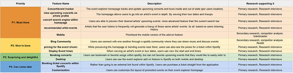
PRODUCT PRIORITIZATION
A feature roadmap was created to visualize users' feature primary and secondary concerns. It ranges all the way from absolute must-haves to things that can come later down the road. These results were taken from 11 interviewees and were all conducted through Google surveys
USER PERSONAS
Multiple interviews helped develop a user persona. It was created to visualize the points at which users most commonly encountered points of confusion or frustration when searching for upcoming artist concerts or festivals. It helped determine which areas of the existing platform could be improved on.


INFORMATION STRUCTURE
TASK FLOWS
This task flow diagram demonstrates the add-on feature's functionality and how the current Spotify application's platform effectively links to it. By offering a unique homepage and previewing an interactive section dedicated solely to discovering events and artists through suggestions or through a search engine

WIREFRAMES
The add-on feature was created as a completely new page that currently does not exist within Spotify. It is accessed through the navigation bar under Events with a rock-on hand gesture icon. Users are greeted with a separate homepage, different from Spotify's main homepage. Here are the features explained:
- The homepage previews favorite artists based on the users' listening history
- The explore new events section shows upcoming events nearby a users location and events around the world based on popularity
- A Spotify user can view an artist's profiles top hits, albums, as well as upcoming events for that specific artist
- If a user needs more detail on the specific event or concert they found, they can view dates, locations ,times, line-up, and preview a calendar view (helpful with tour dates) calendar

Spotify Homepage
Event Explore Homepage
Artist Profile View
Event Information View
Event Calender View
Spotify Homepage
Event Explore Homepage
Artist Profile View
Event Information View
Event Calender View

DESIGN
There was no need to redesign the business’ brand. The color palette, typeface, and logo were kept the same to make the add-on feature as authentic to the actual application as possible. The font name used by Spotify is called Gotham.


FINAL PRODUCT
PROTOTYPE RESULTS
A total of 10 test users were invited to interact with the new Spotify event explorer feature. They were tasked with getting to the event explorer homepage, searching for artists, view 2 different artists profiles, view upcoming tour date information, and view calendar tour dates
Results:
-
100% of users completed each of the tasks
-
100% of users completed each task in 1 minute or less
-
100% of users self-corrected/problem-solved any issues encountered
-
50% of users found some of the event explorer homepage section titles confusing
-
40% of users struggled with the size displayed for Artists Upcoming Events top section
FEEDBACK AND ITERATIONS
Changes were made to the original design based on feedback given by users.
User Feedback:
The titles within the Event Explorer homepage sections were misleading at first
The circle shape size that contains artists pictures were too small for the top section
The trending events near you section and explore artists and venues sections are out of order
Iteration:
The title, Artist events was switched to Favorite artists’ upcoming events.
The title Explore new events was switched to explore artists and venues.
The top circles increased in size
The order of sections were switched so the top: Favorite artists’ upcoming events
middle: Trending events near you,
bottom: Explore new artists and venues
" I don't get it. How is Artist events different from Explore new events if they're 2 different categories?"
"I wish I could see which of my favorite artists were at the top more clearly. It's too small for me"
"I think the trending events near me thats based off my listening history, should be easier accessible in the middle of the page rather than the bottom"

Before:

After:
The above complaints were addressed to clear up confusion and frustration

CONCLUSION
KEY TAKEAWAYS
-
An existing design pattern can be both beneficial and constraining.
-
Spotify's existing user interface and experience pattern helped fast-tracking many of the steps of the design process. However, it also presented me with challenges when attempting to add something completely new while trying to stay as true to the brand as possible. Such as finding and keeping the same font that Spotify uses, screen showing details of multiple listings, and making sure the search engine tool looked the same as what currently exists
-
-
It is important to establish the scope of a project that is appropriate to the allotted time.
-
At the start of the design process, I had a lot of additional ideas that I wanted to implement into the final product. However, as I got down to the details of things, I realized that it would require much more time than anticipated. Realistically, pursuing all these ideas had the potential to waste resources.
-
FUTURE STEPS
Features to develop or improve on, given the time and resources:
-
Create a Spotify blog community where users can connect with each other, share concerns, or create new ideas
-
Develop a customizable profile page that previews a users history of events they attended